Thousands of premature death every year can be attributed to air pollution in London. More than 4000 only to fine particulate matter called PM2.5. This is 20 times more than road fatalities!
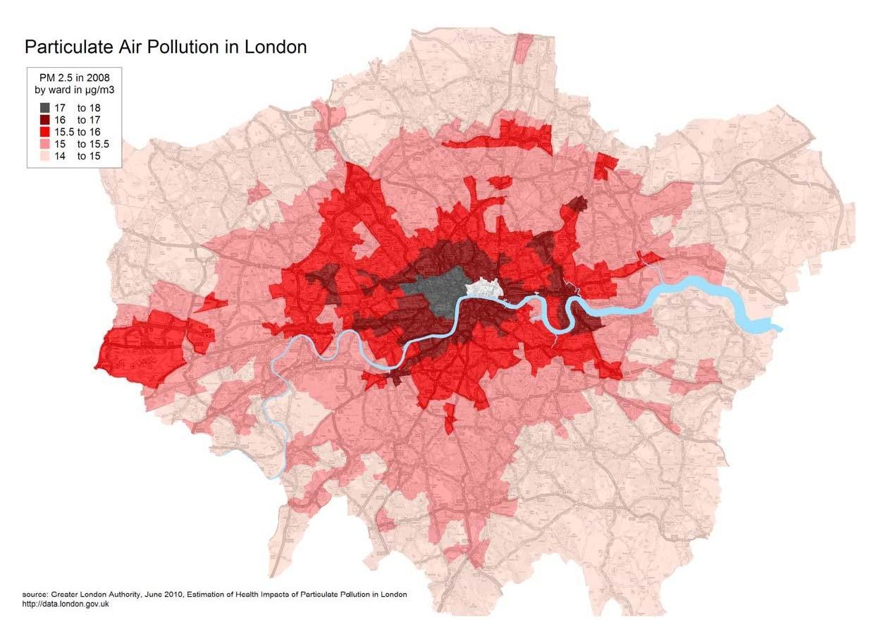
In this context, I worked on the data coming out of a study on PM2.5 commissioned by the Greater London Authority [June 2010 report]. The data tells us that:
- Camden is the second most polluted London Borough, after Westminster,
- More than 100 people in Camden die from PM2.5 pollution each year.
I designed a couple of maps to show the levels of pollution across London and across Camden. They highlight the contributions of Heathrow airport and of road traffic. On the Camden map, you can see hundreds of black dots representing the premature deaths attributable to PM2.5. The dots do not indicate an accurate location but their quantity is precisely matching the number of deaths by ward.
– – – – – – – – London Map – – – – – – – – – – – – – – – Camden Map – – – – – – – –


If you believe things must change, please have a look at the draft London Air Quality Strategy. Consultation goes on until 13 August, 2010 – 17:00. Let’s together use this blog to discuss the Mayor’s strategy and prepare a collective input to the debate!
First, and in order to trigger a debate, the Mayor seems to believe in electric vehicles and in the possibility of a smoother traffic flow. Other cities go the other way round and invests in tramways, bus priority and pedestrianised streets. Which strategy is the best? Hard to tell… but which one would deliver a broad range of long term benefits across policy areas?
Alex

Susan